

 United Kingdom
 Denmark
 Norway
 Sweden
 Italy
Italy Netherlands
 Finland

Cisco-Ausbildung
Insoft Services ist einer der wenigen Schulungsanbieter in EMEAR, der ein umfassendes Angebot an Cisco-Zertifizierungen und spezialisierten Technologieschulungen anbietet.
Lesen Sie mehr
Cisco Zertifizierungen
Erleben Sie einen Blended-Learning-Ansatz, der das Beste aus von Lehrern geleiteten Schulungen und E-Learning zum Selbststudium kombiniert, um sich auf Ihre Zertifizierungsprüfung vorzubereiten.
Lesen Sie mehr

Cisco Learning Credits
Cisco Learning Credits (CLCs) sind Prepaid-Schulungsgutscheine, die direkt bei Cisco eingelöst werden und die Planung für Ihren Erfolg beim Kauf von Cisco-Produkten und -Services erleichtern.
Lösen Sie Ihre CLCs ein

Cisco Continuing Education
Das Cisco Continuing Education Program bietet allen aktiven Zertifizierungsinhabern flexible Optionen zur Rezertifizierung, indem sie eine Vielzahl von in Frage kommenden Schulungselementen absolvieren.
Lesen Sie mehr

Cisco Digital Learning
Zertifizierte Mitarbeiter sind GESCHÄTZTE Vermögenswerte. Erkunden Sie die offizielle Digital Learning Library von Cisco, um sich durch aufgezeichnete Sitzungen weiterzubilden.
CDLL-Katalog

Cisco Business Enablement
Das Cisco Business Enablement Partner Program konzentriert sich auf die Verbesserung der Geschäftsfähigkeiten von Cisco Channel Partnern und Kunden.
Lesen Sie mehr

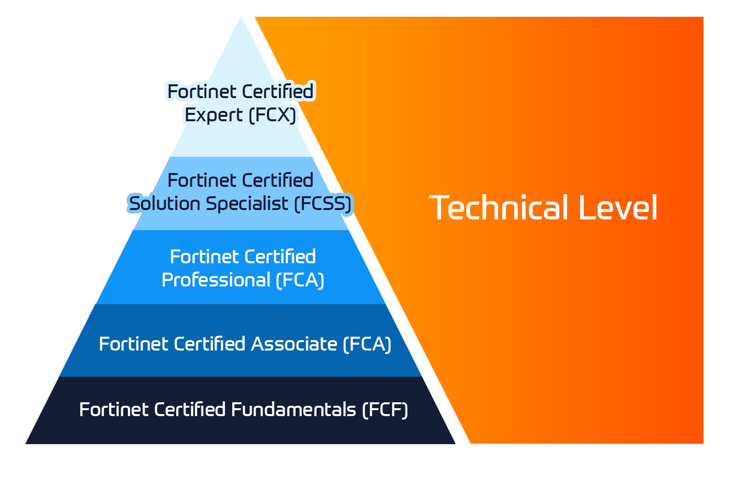
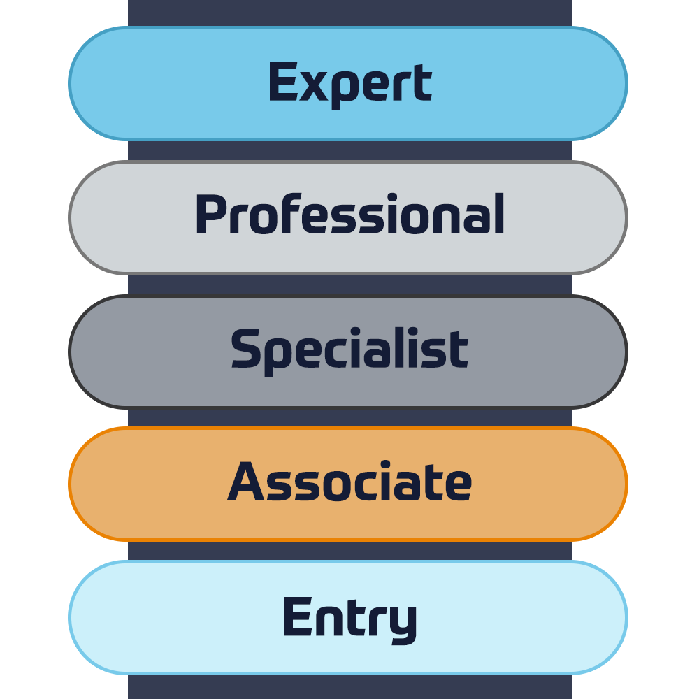
Technische Zertifizierung
Das Fortinet Network Security Expert (NSE) -Programm ist ein achtstufiges Schulungs- und Zertifizierungsprogramm, um Ingenieuren ihre Netzwerksicherheit für Fortinet FW-Fähigkeiten und -Erfahrungen beizubringen.
Technische Kurse

Fortinet-Ausbildung
Insoft ist als Fortinet Authorized Training Center an ausgewählten Standorten in EMEA anerkannt.
Lesen Sie mehr


Fortinet Service-Pakete
Insoft Services hat eine spezielle Lösung entwickelt, um den Prozess der Installation oder Migration zu Fortinet-Produkten zu rationalisieren und zu vereinfachen.
Lesen Sie mehr

Microsoft-Ausbildung
Insoft Services bietet Microsoft-Schulungen in EMEAR an. Wir bieten technische Schulungen und Zertifizierungskurse von Microsoft an, die von erstklassigen Instruktoren geleitet werden.
Technische Kurse

Extreme-Ausbildung
Erfahren Sie außergewöhnliche Kenntnisse und Fähigkeiten von Extreme Networks.
Technische Kurse

Technische Zertifizierung
Wir bieten einen umfassenden Lehrplan für technische Kompetenzen zur Zertifizierung an.
Lesen Sie mehr

Extreme Schulungskatalog
Hier finden Sie alle Extreme Networks online und den von Lehrern geleiteten Kalender für den Klassenraum.
Lesen Sie mehr
ATP-Akkreditierung
Als autorisierter Schulungspartner (ATP) stellt Insoft Services sicher, dass Sie die höchsten verfügbaren Bildungsstandards erhalten.
Lesen Sie mehr

Lösungen & Dienstleistungen
Wir bieten innovative und fortschrittliche Unterstützung bei der Konzeption, Implementierung und Optimierung von IT-Lösungen. Unsere Kundenbasis umfasst einige der größten Telcos weltweit.
Beratungspakete
Ein weltweit anerkanntes Team von zertifizierten Experten unterstützt Sie bei einem reibungsloseren Übergang mit unseren vordefinierten Beratungs-, Installations- und Migrationspaketen für eine breite Palette von Fortinet-Produkten.


Über uns
Insoft bietet autorisierte Schulungs- und Beratungsdienstleistungen für ausgewählte IP-Anbieter. Erfahren Sie, wie wir die Branche revolutionieren.
Lesen Sie mehr
 Duration
 Delivery
  Price
Price